
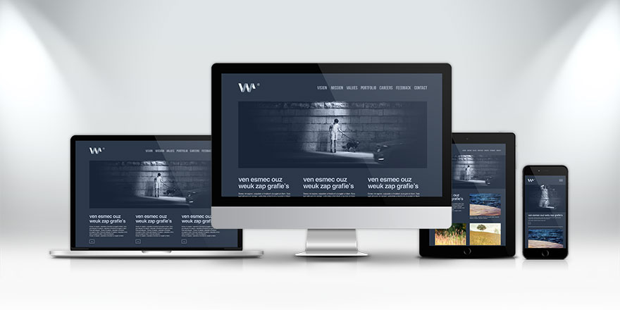
Responsive web design (RWD) is an approach that ensures web applications render well on a variety of devices and screen sizes. As the number of devices used to access the web has skyrocketed, the importance of responsive design has become paramount. This article explores the evolution of responsive web design, its principles, techniques, and best practices for modern web developers.
The Need for Responsive Design
With the advent of smartphones, tablets, and various screen sizes, the traditional approach of creating separate versions of websites for different devices became inefficient and unsustainable. Users expect seamless experiences across devices, whether they are using a desktop computer, a tablet, or a smartphone. This shift in user behavior has driven the evolution of responsive web design.
Key Milestones in the Evolution of RWD
- Fixed Layouts: Early web design often utilized fixed layouts, where content was designed for a specific screen size. This approach was limiting, as it did not adapt to varying display sizes.
- Fluid Layouts: As designers sought to accommodate different screen sizes, fluid layouts emerged. These layouts used percentage-based widths, allowing elements to resize relative to the browser window. While fluid layouts were a step forward, they still faced challenges with content readability and usability on smaller devices.
- Media Queries: Introduced in CSS3, media queries allowed developers to apply different styles based on the characteristics of the device, such as its width, height, and orientation. This advancement enabled the creation of responsive designs that could adapt to various screen sizes and resolutions.
- Mobile-First Design: The mobile-first approach emphasizes designing for smaller screens before progressively enhancing the experience for larger screens. This philosophy ensures that essential content and functionalities are prioritized for mobile users, leading to better overall experiences.
- Responsive Frameworks: The development of responsive frameworks, such as Bootstrap and Foundation, has made it easier for developers to create responsive websites. These frameworks come with pre-designed grid systems and components that simplify the process of building responsive layouts.
Principles of Responsive Web Design
- Fluid Grids: Use a fluid grid layout that employs percentage-based widths rather than fixed pixel values. This allows elements to scale proportionally to the screen size.
- Flexible Images: Ensure that images and media scale within their containing elements. Use CSS properties like max-width: 100%; to prevent images from exceeding their parent container’s width.
- Media Queries: Implement media queries to apply different styles based on the device’s characteristics. This allows for adjustments in layout, font sizes, and other design elements based on screen dimensions.
- Viewport Meta Tag: Use the viewport meta tag to control the layout on mobile browsers. This tag allows you to set the initial scale and dimensions, ensuring that your website is rendered appropriately on various devices.
Best Practices for Implementing Responsive Design
- Prioritize Content: Start by identifying the most critical content for your users. Design with a mobile-first approach to ensure that this content is easily accessible on smaller screens.
- Test Across Devices: Regularly test your design on multiple devices and screen sizes to identify any issues. Emulators and browser developer tools can help simulate various environments.
- Optimize Performance: Focus on performance optimization by minimizing the size of images, leveraging browser caching, and optimizing CSS and JavaScript. Faster load times enhance the user experience on all devices.
- Design for Touch: Consider touch interactions when designing for mobile devices. Ensure that buttons and interactive elements are adequately sized for touch input, providing enough space for users to interact without frustration.
- Use Breakpoints Wisely: Set breakpoints at key points where the design needs to adapt. Common breakpoints include 320px (mobile), 768px (tablet), and 1024px (desktop). However, adapt these values based on your specific design requirements.
- Consider Accessibility: Ensure that your responsive design is accessible to all users, including those with disabilities. Use semantic HTML, provide text alternatives for images, and ensure that navigation is keyboard-friendly.
Conclusion
The evolution of responsive web design has transformed how websites are built and experienced across devices. By embracing the principles and best practices of RWD, developers can create flexible, user-friendly, and visually appealing websites that cater to a diverse audience. As technology continues to advance and new devices emerge, responsive design will remain a critical component of effective web development, ensuring that users have a seamless experience, regardless of how they access the web.